Sketchbook Pages - National Portrait Gallery (London) and Museum of Natural History (Oxford)

So, towards the end of 2019, I stopped loving illustration and began to fall out of interest with process. Lots of client projects and travelling for live illustration events (which I was very lucky to be doing) meant little time for ‘personal projects’… And, truth be told, even my personal projects had begun to feel a bit like ‘work’. After years of trial and error, I’d finally found a ‘style’ that I was happy with and a process that allowed me to effectively complete clients’ briefs to a good standard, so I almost felt too scared to try anything different… Yet, I was getting increasingly bored with it and totally lacking inspiration…

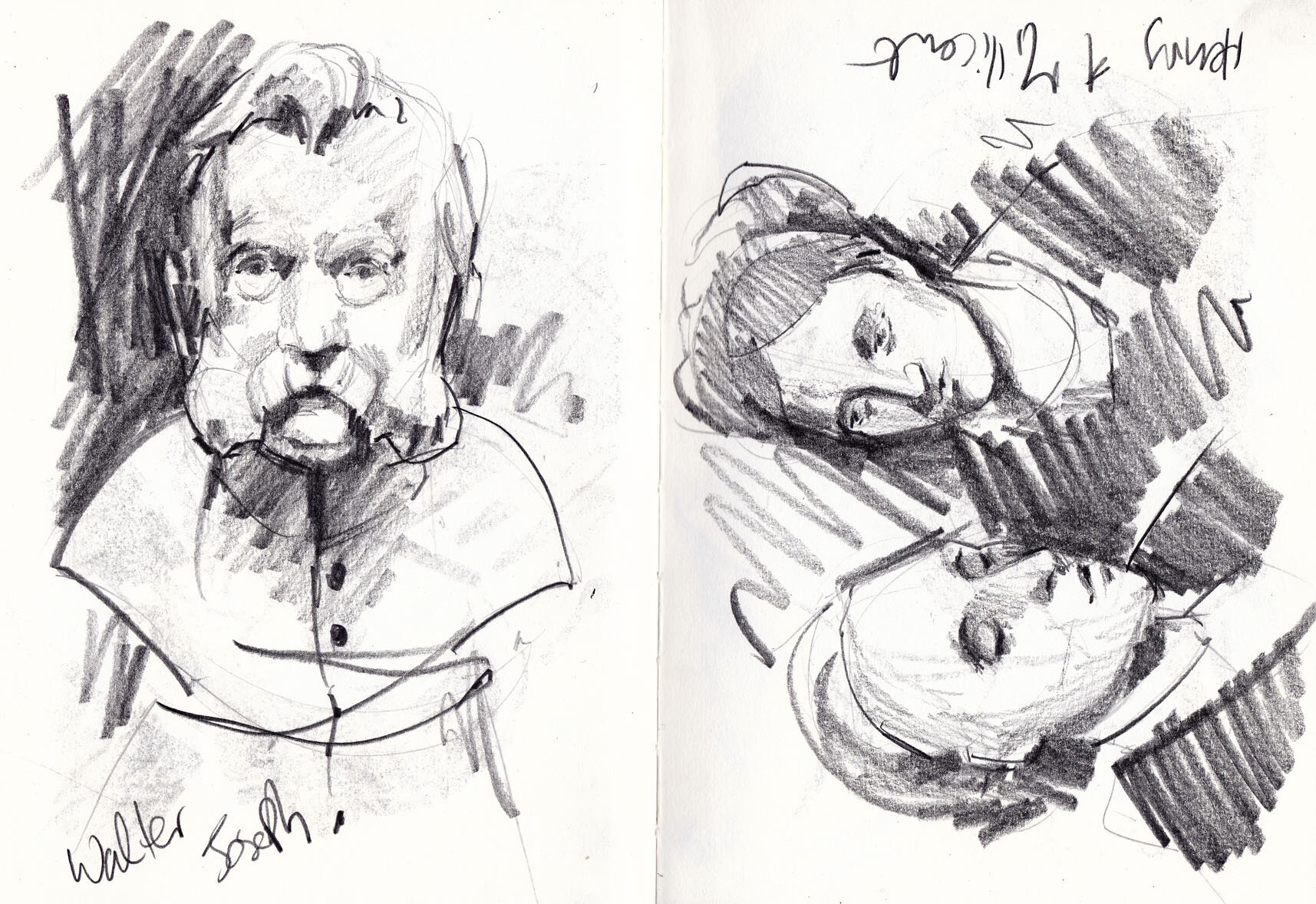
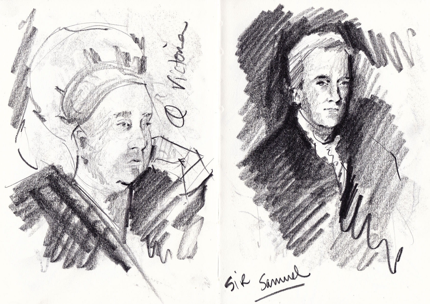
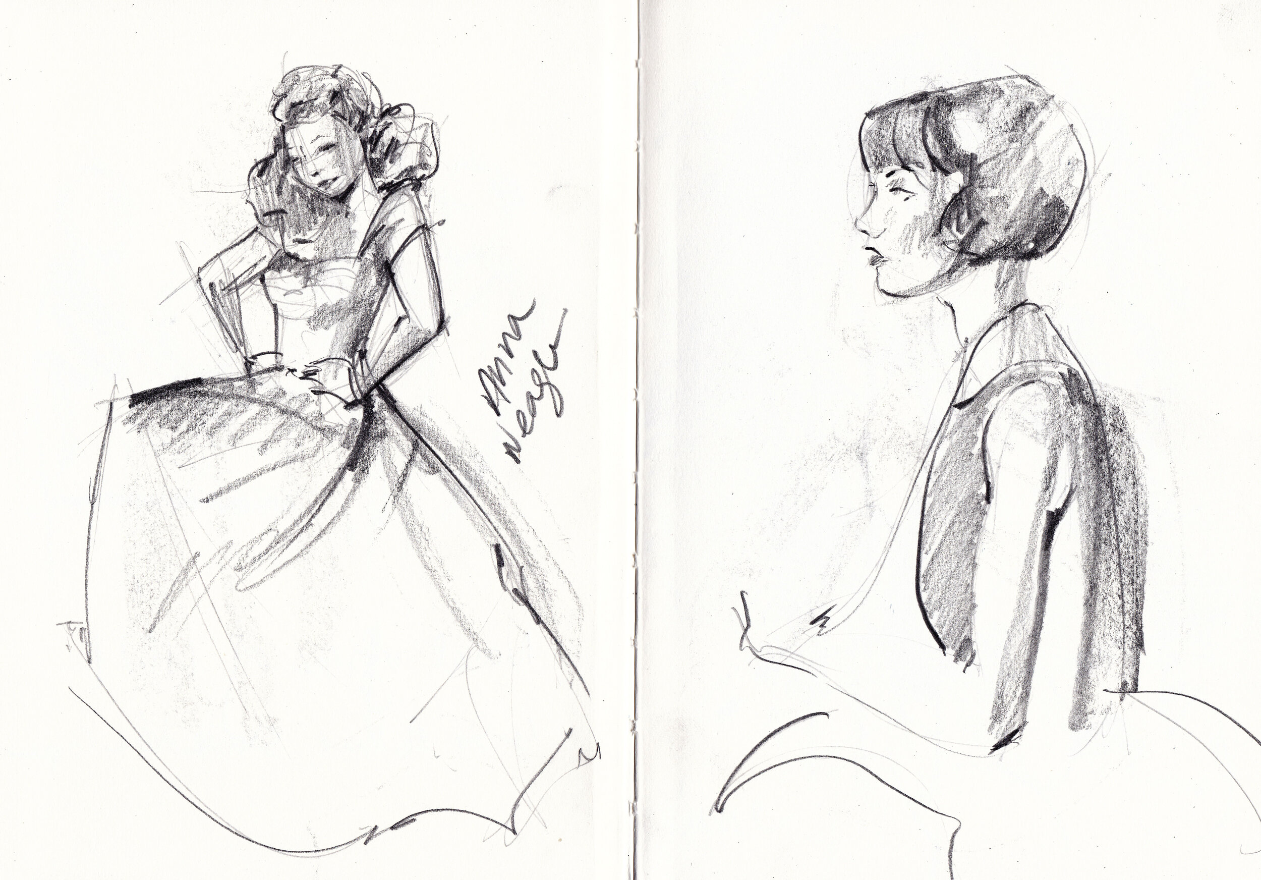
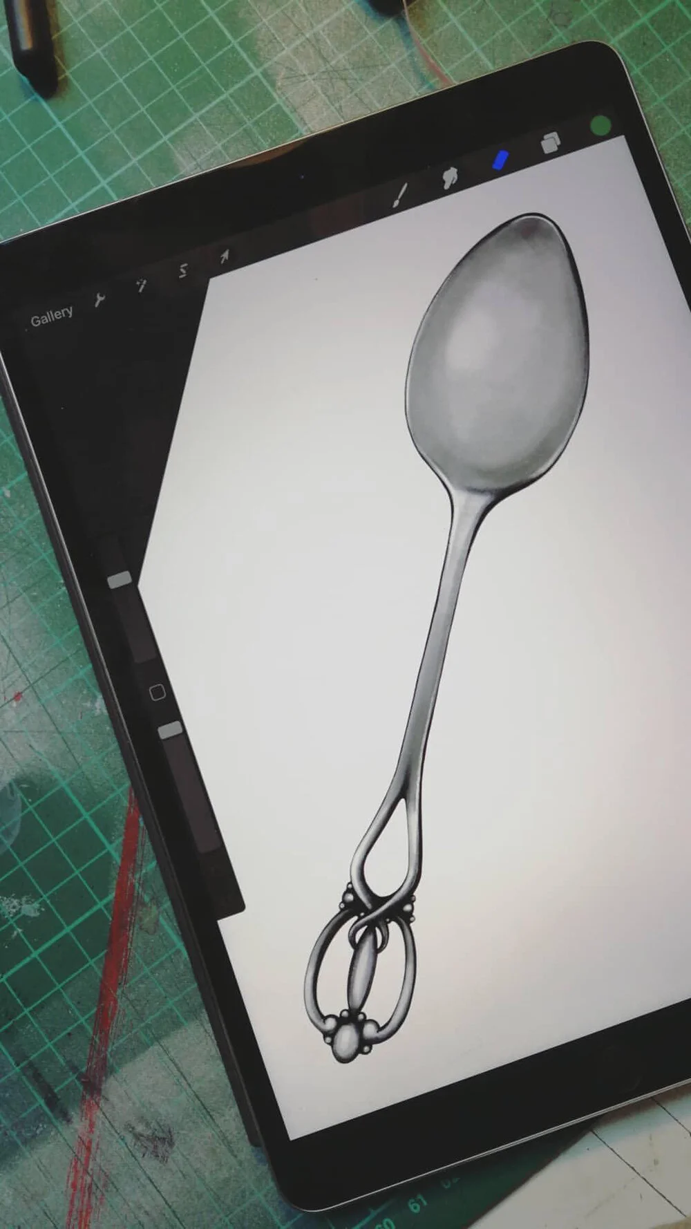
Luckily, after a long Christmas break I began to feel more creative, so I sat down for a meeting with my illustration agent at Lipstick of London. She could tell exactly how I was feeling and told me that she thought I really needed some ‘play time’. ‘Just grab a sketchbook and start sketching - it doesn’t matter what comes out, it doesn’t matter if it’s total shit, just get back to enjoying illustrating again.’ I pushed back quite hard, saying I hated working in a sketchbook and I wasn’t very good at drawing for the sake of drawing - ‘I’m a project person!’, I insisted. Anyway, long story short, I took her advice… I had nothing to lose… We’d had our meeting on the South Bank so I was only a short walk away from the National Portrait Gallery so I headed straight there. I went straight to the gallery shop, bought a sketchbook, a pencil and a graphite stick and off I went.

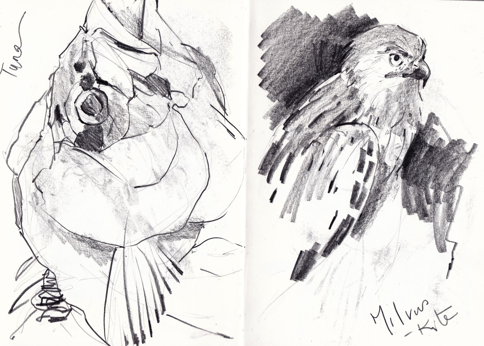
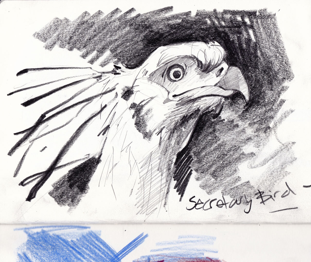
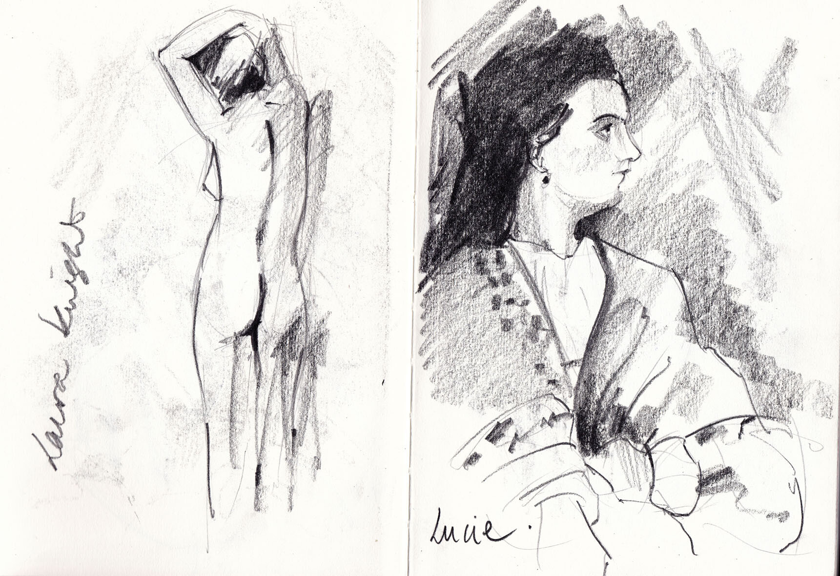
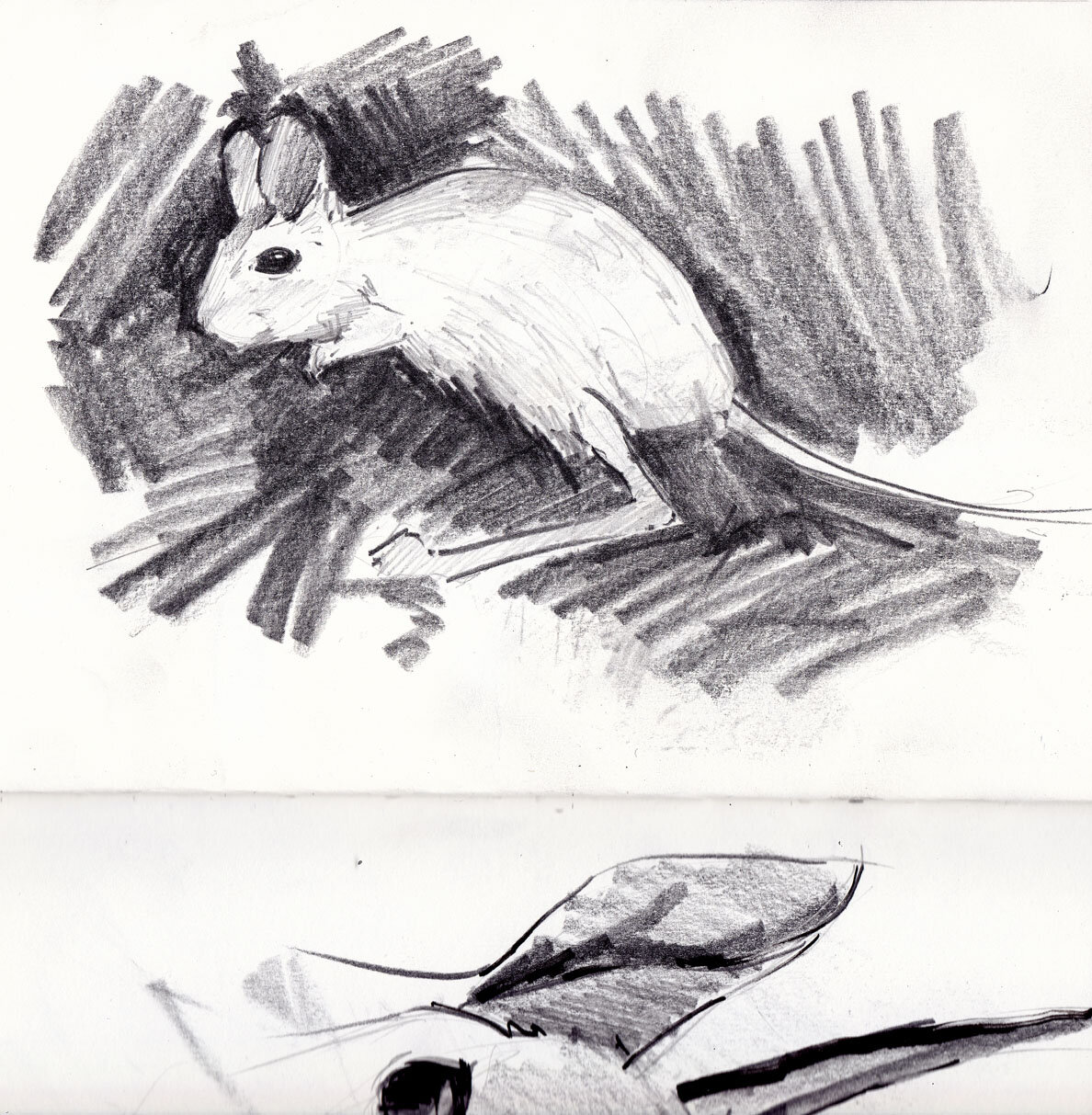
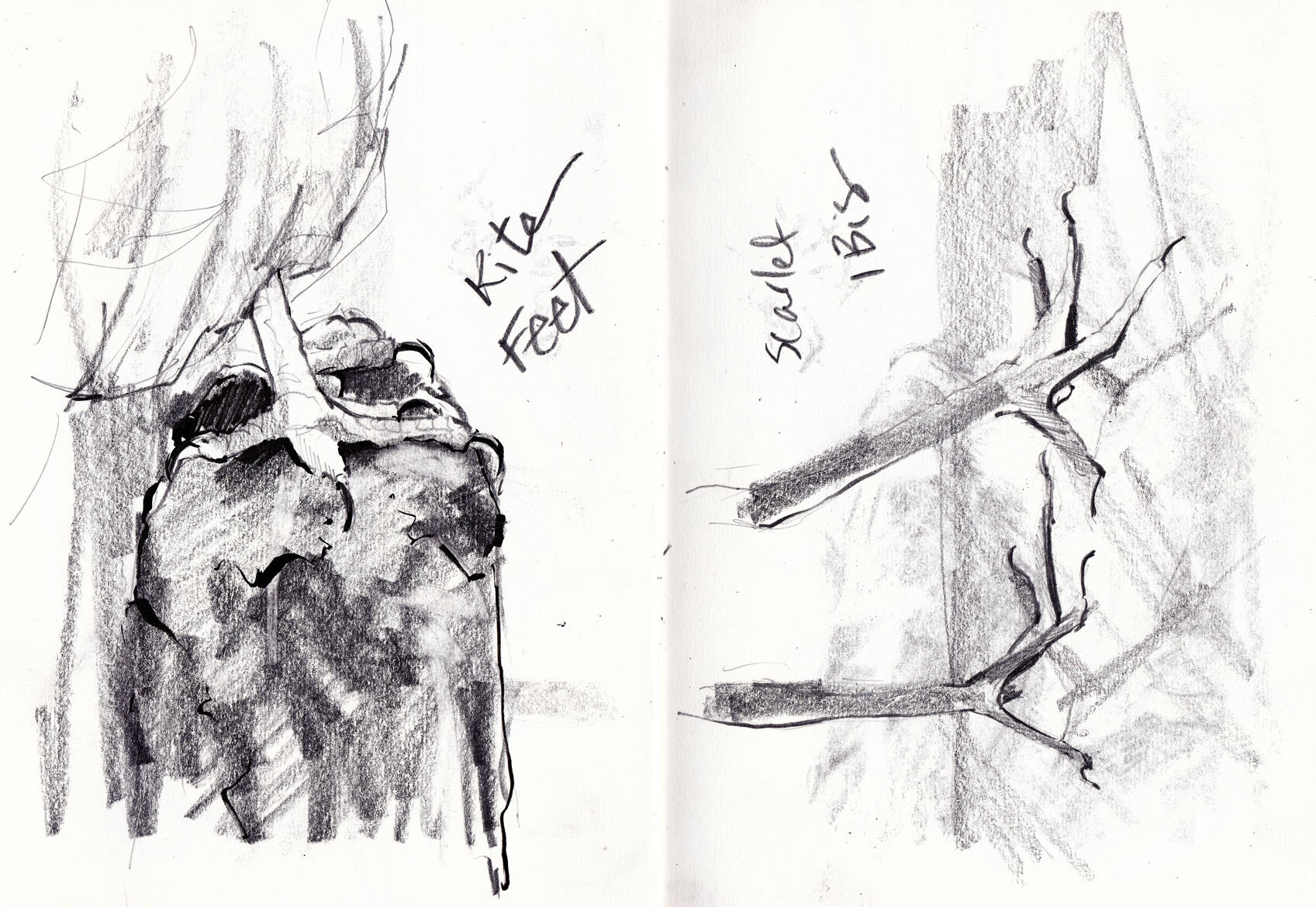
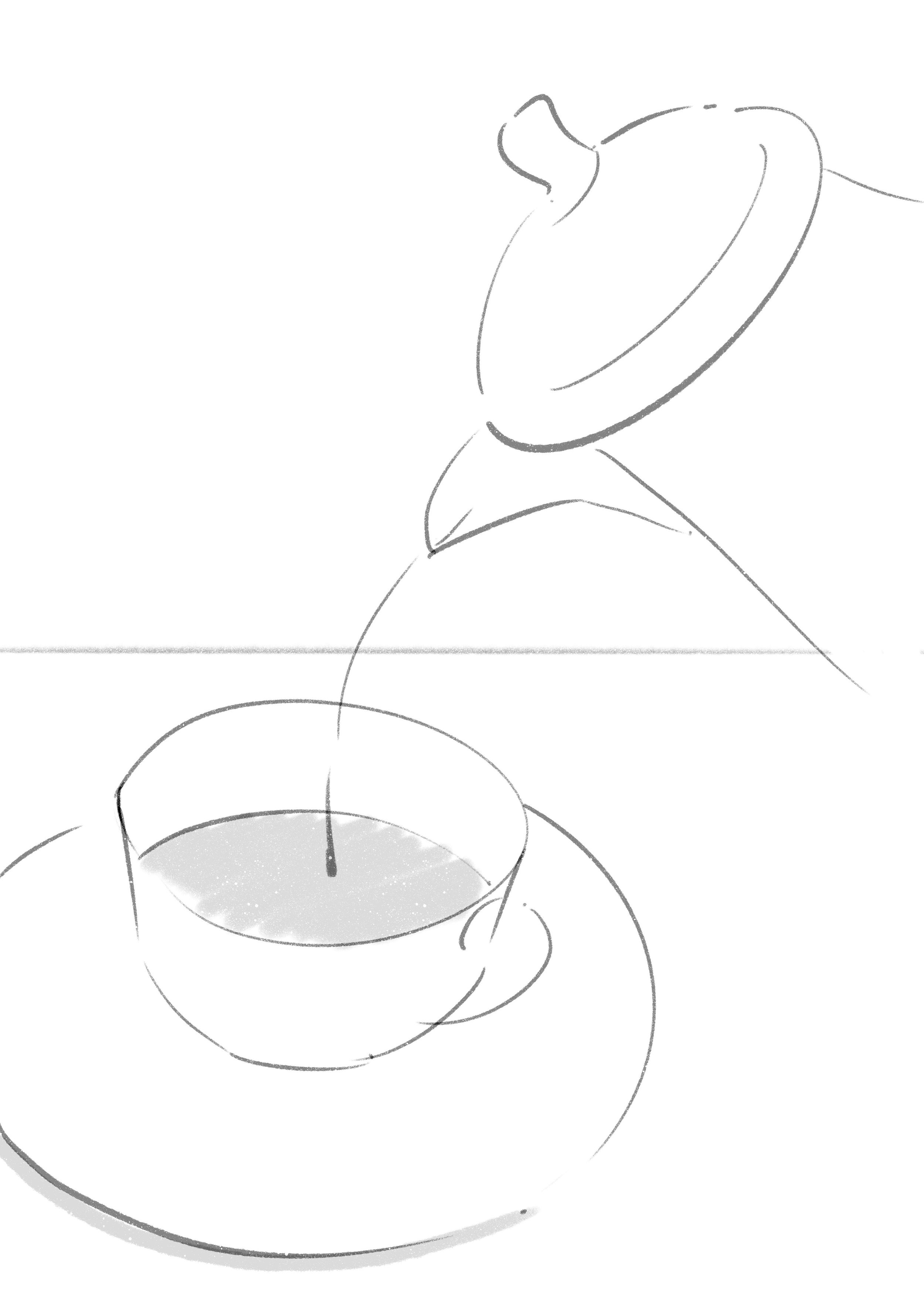
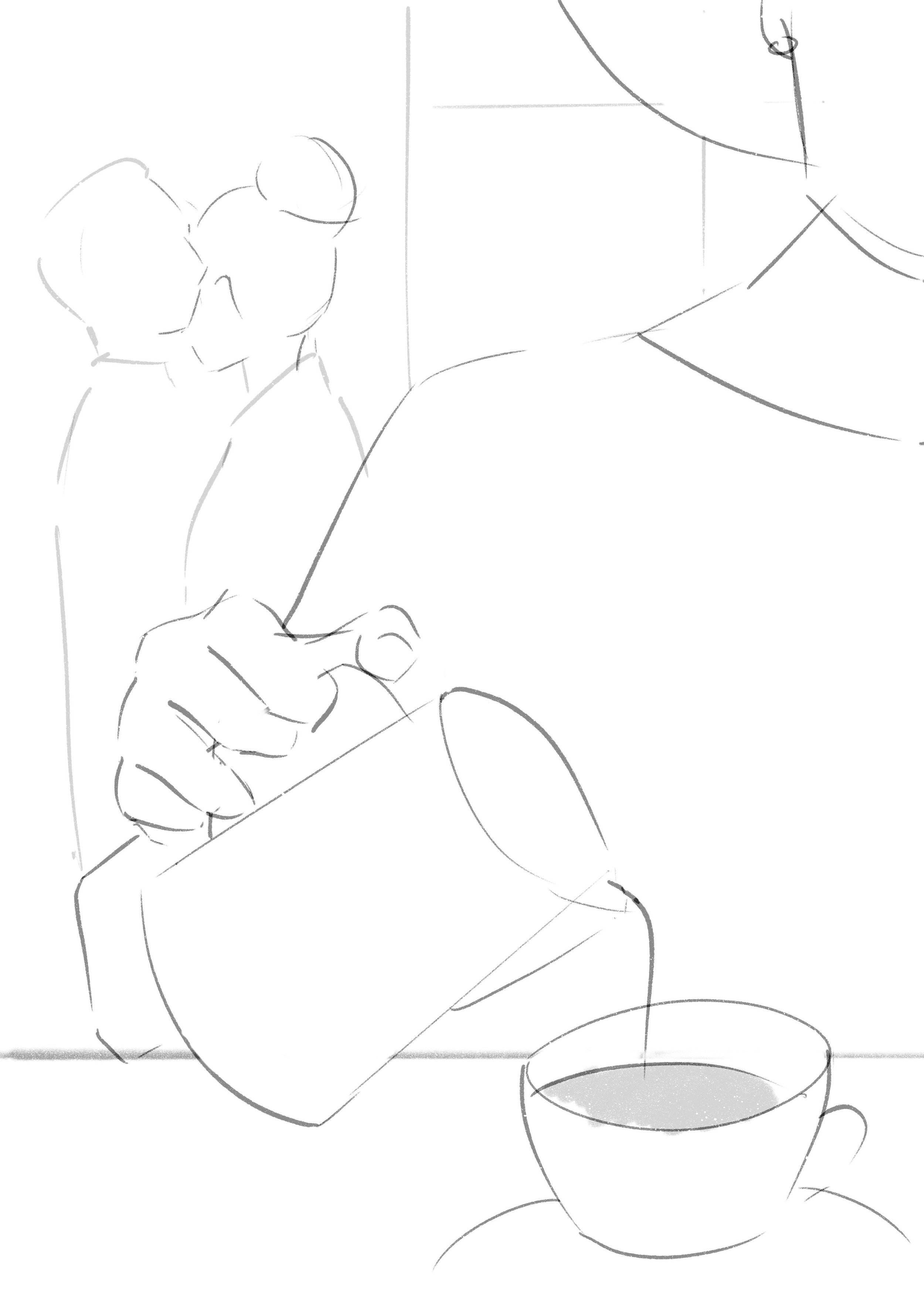
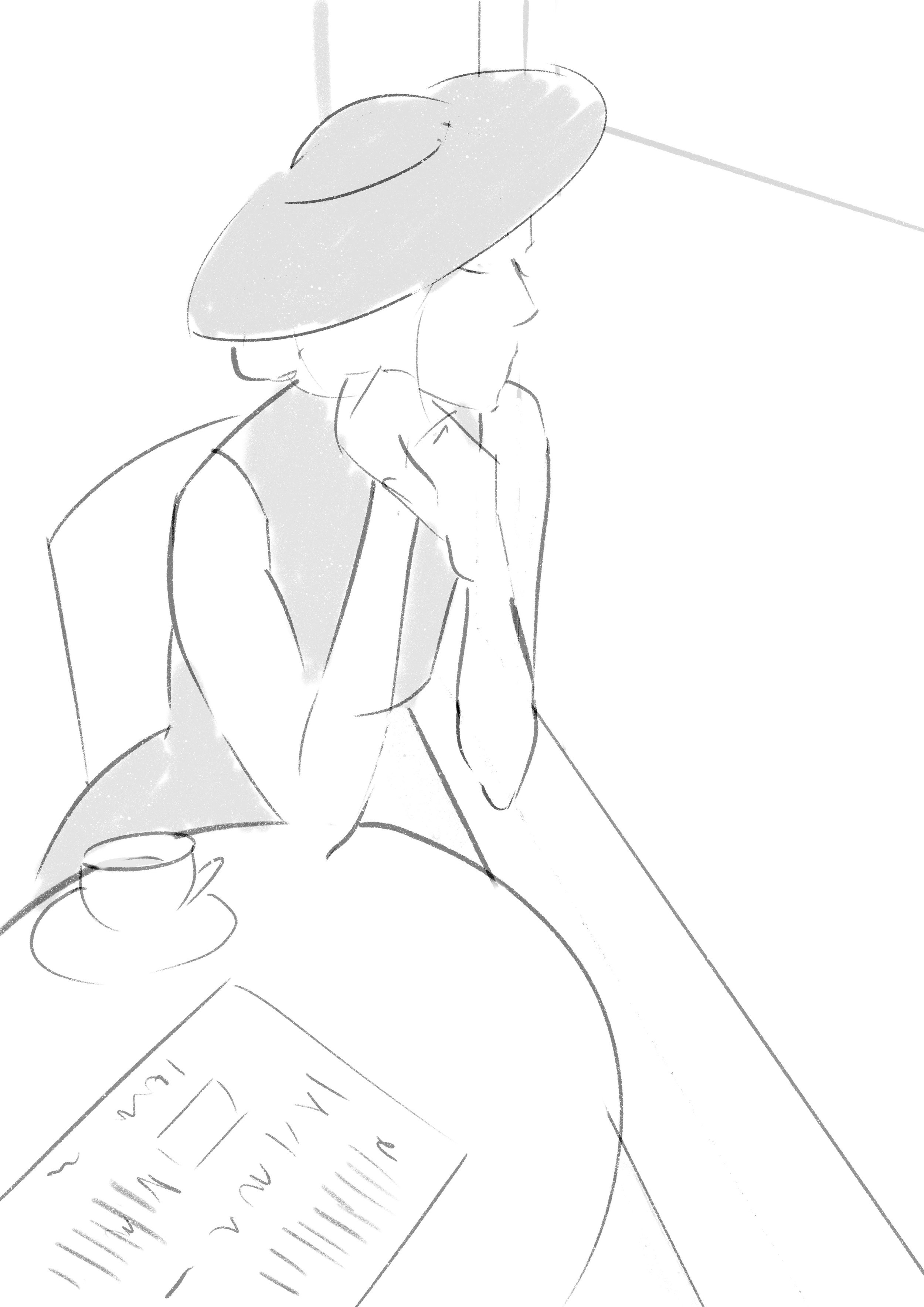
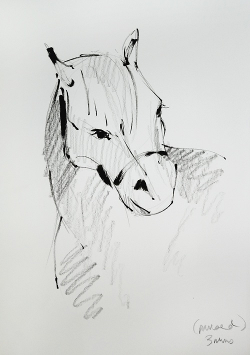
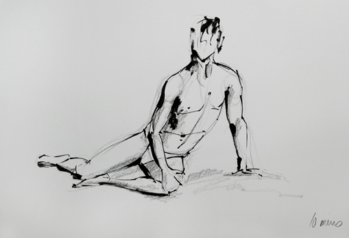
Oh the relief! The joy! Scribbles after scribbles and I just lost myself. I lost myself in the paintings, in the shadows, in the highlights and in the expressions. 2 and a half hours of pure bliss. Which was followed up by another sketching session at the Oxford University Museum of Natural History a few weeks later. This one was made even better because I went with some other illustrators as part of the Oxford Doodle Club. Which is actually a little side project/meet up/club thing that I helped to set up with fellow illustrators Mat Roff and Alex Moore… Find out more here. It’s pretty great.

Moral of the story, if you’re feeling stuck/bored/uninspired... Get sketching.

Illustrated Packaging Design - Peppermint Tea

It’s been a while since I’ve blogged and that’s because it’s been a fairly hectic few months! Last month I moved about an hour down the road from Evesham, Worcestershire to Banbury, Oxfordshire! Moving, as always was pretty stressful, but things are finally getting back to normal and I’ve made some amazing connections here already… As I was feeling a little ‘creatively stuck’ in the weeks leading up to the move, I gave myself a little bit of time off from personal work so as soon as I’d settled in my new studio I sat down I had a good hard look at my portfolio (and a chat with my agent!). The thing that stuck out the most was that I was missing ‘work in context’, I had lots of different types of illustrations but nothing showing how they could be used by commissioners… So I decided to work on an illustrated packaging project, which is something I’ve always wanted to be hired for, and combined my love of typography, layouts and illustration. They say you should always put out what you want to get back, so here’s my call out to the universe!!

My favourite thing in the whole entire world is peppermint tea so it was a pretty easy choice and it gave my an excuse to illustrate some vintage teaware… I wanted to create something that was fresh and vibrant whilst being luxurious and classy. Something that stood out on the shelves but you could also look at more closely to see interesting details.

Below are my initial sketches for the project… I use my iPad for sketching these days as it allows me to quickly get ideas down. Procreate is a great iPad program which allows you to sketch, add colour to and change the size/scale of elements effortlessly which means you can work through lots of possibilities in no time at all.

initialsketch.png

Once I had roughly worked out the layout I began drawing up the different elements, starting with the teapot and teacup. I had lots of fun researching vintage teaware and creating a set which combined different bits of all the ones I liked the most! I then moved on to sketching out some peppermint leaves…

Teapot Sketch
Leaf drawing

The next step involved digitally colouring and editing my sketches and creating a leaf pattern from my leaf sketches. As with most of my illustrations, I start in Adobe Photoshop before moving them into Procreate on my iPad for final touches… The leaf pattern was created in Adobe Illustrator as it allows you to create seamless patterns.

spoon.jpg
Teaware_Elements.jpg

As you can see from my sketches, my original plan was actually to mock these designs up on a box rather than a tin, however as the project evolved I decided to change this. Below you can see two of my initial ideas for the front face of the box, involving peppermint tea leaves being poured from the teapot… Although these work as stand alone illustrations, when they were mocked up on the box they didn’t work. The first one looked way too busy and the second was too ‘green’ without the leaves in the background. Also, it didn’t seem to flow so well on a rectangular box I decided to change the design to work on a circular tin instead… This was one of the main things I learnt during this little project, that just because something works on it’s own, doesn’t mean its necessarily going to look good on packaging.

1st.png
2nd.png

For the peppermint typography I started by sketching out my ideas on my iPad before taking a final drawing into Adobe Illustrator and refining the curves.

peppermint.png

Finally, I worked to bring all the elements together, along with the logo and barcode to create a seamless design that could be wrapped around a tin. I used a free mock up template from GraphicBurger to show how my design would work on packaging. It was lovely to be able to bring my designs to life using a mock up template, so I will definitely be trying it out again!

FINAL-tea-.png
Mockup-SideA.png
Mockup-SideB.png
MockUp-Complete.png

Portrait Illustrations - Behind the scenes

I recently did two new portrait illustrations for my portfolio as I realised everything was beginning to look a little feminine… I’m a huge fan of these two and their wonderful series (Weird Weekends and Sherlock - OMG!!!) so it was great fun drawing them. I also thought it would be a good idea to show a bit of a ‘behind the scenes’ look at how I illustrate portraits (and most things for that matter!)…

Everything starts out as a sketch, which then gets inked up on my favourite paper (Strathmore Bristol Board Smooth) using a black Tombow brush pen and a worn out grey Promarker (to give that smudgy effect!). As a side note, for materials I highly recommend using Jackson’s Art Supplies, they are competitively priced and haven’t failed me yet!

After I’m happy with the drawing, I scan it in and open up Adobe Photoshop where I start adding more tones and colour. This is done using lots of layers and translucent brush strokes, I treat it sort of like a digital painting… Then, I move it over to my iPad and using Procreate I clean up the edges and add further highlights and shadows. Finally, the illustration gets opened up back in Photoshop for any final touches, which usually consists of dodging and burning the shadows/highlights to really make things stand out…

IMG_20190708_151928.jpg
IMG_20190703_090310.jpg
IMG_20190702_094316.jpg
louissketch.jpg
benedict.jpg
LouisTheroux.jpg
BenedictCumberbatch.jpg

Portrait Illustrations - International Women

Recently when I was reviewing my own portfolio I realised that a lot of my portraits and illustrations were of the same type of people, doing the same type of things, wearing the same type of clothes… So I decided to create a series of illustrated portraits inspired by different (and potentially under-represented) countries. I captured women in their traditional outfits, with traditional hairstyles/makeup to highlight beauty around the world. I have also chosen colours to represent each nation and although there are varying interpretations for the meaning behind these colours within their cultures, I have detailed some ideas below…

Indian woman portrait illustration

India

Green is featured on the Indian flag. It is said to represent growth, the harvest and fertility.

Chinese woman portrait illustration

China

Red features on the Chinese flag and it is a hugely popular colour there. This is probably because it is said to represent luck, wealth and beauty.

Russian woman portrait illustration

Russia

The blue in the Russian flag is said to represent the monarchy, however some people also say it is there to symbolise faithfulness and honesty.

Nigerian woman portrait illustration

Nigeria

Although purple doesn’t feature on the Nigerian flag, it is still chosen by many for weddings. This is because it is said to symbolise prestige and wealth. It is often combined with gold to represent extravagance.

Sketchbook - Building and Interior Illustrations (Liverpool Cathedral)

Last month I visited Liverpool for the first time (a friend was having her wedding reception there), and somewhere that really interested and inspired me was Liverpool Cathedral. It was finished in 1978, took 74 years to build and turns out it’s one of the biggest in the world! If you haven’t been before, it’s pretty spectacular… Its vast structure looms over the city and can be seen from pretty much everywhere as its on a hill. Inside it’s quite bare compared to some others I’ve been to, and its main allure is the spaciousness, the sheer height of the ceilings and the noble archways throughout. There’s a gorgeous (and massive) stained glass window at one end but what captured me the most was the light and shadow cast by the pillars and archways…

These are pretty rough sketches (I think I like the first one the best) but what I’m really enjoying about blogging is being able to post these rough illustrations somewhere, mostly because its actually makes me do them in the first place! As you can probably tell from my portfolio, portraiture is my favourite subject, but what I’ve been trying to do over the last few months is break away from that and improve other areas of my work. One of the main ones being interiors, perspective and interesting angles/compositions. I’ve come to realise that there is actually quite a large gap in my knowledge when it comes to these things… I can clearly remember being taught the fundamentals of portrait drawing as a child and again as a student. About the formula for mapping out a face and where the highlights/shadows should fall and even though I can remember being taught it, it’s now so ingrained in me that these things just come naturally to me when I draw a face now. Furthermore, when I worked as a memorial artist and my job was often to paint portraits, which meant I learnt (through lots of practice) about the tools and tricks to capture a likeness. On the other-hand, I think I must have been ill for when we were taught about perspective or maybe we weren’t ever taught it, but I certainly can’t bring to mind the same formulas when trying to draw a building or sketch the inside of someone’s living room.

So I’m kind of having to go back to basics a little bit and learn through doing. I don’t have a physical sketchbook, I find them a bit restricting and prefer to just use single sheets of paper. Once I’ve got the line work down, I’ve found I’m really enjoying using Photoshop to quickly add block shading. It’s really helping me to understand where light and dark need to go in order to successfully create a feeling of depth in an illustration. I think that’s the main thing about drawing/sketching/illustrating/creating, it’s about really understanding the shapes behind what you’re drawing and then learning how to translate it.

Tom's Diner - Storyboard Sketches

This is a mini project I’ve wanted to do for years, but never got around to it because I was worried I would mess it up...  It’s a short collection of illustrations inspired by a song called ‘Tom’s Diner’ by Suzanne Vega which is basically a poem about a woman in a café.  My parents love Suzanne Vega so I was brought up listening to her and that song always inspired me.  I wanted to do a set of illustrations that were sort of like a storyboard when put together but could also work on their own as single images.

I’m not sure whether its intrigue or sadness that’s hiding amongst the subtle lyrics but ever since my first listen, it captivated me.  The simplicity of the song has always made me feel like there was more to it…

I wanted to explore my own interpretation of the song through illustration so that I could give other people the same experience that I had had.  Is there something we don’t know?  Who is the woman shaking her umbrella?  Is she having an affair with the man behind the counter?  Why is no one else in the diner?  There’s a mystery and a quietness to the diner that makes it somewhat eerie.  There are missing pieces to the puzzle that I have tried to echo in my illustrations.  Elements have been left  out, either through cropping or zooming in, so you must make up the rest.  I’ve kept the palate to a minimum, using grey to give a ‘vintage-y’ sad sort-of-a feel and a pop of deep red to tie them all together.  I also used this red to break up the calm within the illustrations, signalling that things aren’t quite what they seem.

It’s challenging creating things from the depths of your imagination, but even more so is the challenge to convey a certain emotion in everyday objects or environments.  I suppose you’re never really sure whether it ‘translates’ or not, but perhaps that’s the beauty of it… 

Below are my initial sketches for the project, some stayed the same in the final illustrations but I ended up changing some elements. I am currently unveiling the final illustrations over on Instagram but once they are all unveiled, you will be able to see them all by clicking here. I created these sketches using my iPad, something I haven’t done before but really enjoyed. It was great being able to quickly sketch up and adjust things without using copious amounts of paper!

Buildings Illustration - Russia

My last blog post was on the 5th of April!  How time flies…  So, this is just a mini post really to check in as well as to showcase some quick building inspired illustrations that I posted on Instagram recently.  I do have some ideas for some other more ‘in depth’ posts but it’s just finding the time to fit it all in alongside client work and illustrating a series of images for a personal project - but I shan’t complain, it’s wonderful to be a busy bee! :-)

I’ve been trying to do more sketch-y/unfinished work because I spend a lot of time doing ‘finished’ pieces and I have to say, I’ve been really enjoying it!  The last post featuring interiors illustrations inspired me to do some more, so after going to watch ‘The White Crow’ at the cinema (a film about Russian ballet dancer Rudolf Nurejev) I decided to google some beautiful Russian architecture and sketch…

This time I decided to add another dimension to my sketches by adding some subtle block shading/greys in Adobe Photoshop to certain parts of the illustration so that the eye could differentiate better between the different building/elements in the illustration.  I think this really adds to the sketches and gives them a more ‘finished’ look without making them look overly polished. I’m looking forward to experimenting more with sketching over the next few months!

Vaganova Ballet Academy, Russia

Vaganova Ballet Academy, Russia

St Petersburg, Russia

St Petersburg, Russia

 
Ufa Cathedral, Russia

Ufa Cathedral, Russia


Interior Illustration, Sketching and Intuitive Drawing.

People always ask me when I’m illustrating at live events ‘How do you do it?’ ‘How do you manage to just draw something on the spot in a few minutes?’, and my answer is always this: ‘I take my brain out…’

It’s a funny thing to say; ‘I take my brain out’, but I don’t know how else to describe it.  It’s basically about being intuitive and not thinking too much, or rather, not thinking at all.  I talk about actually ‘taking my brain out’ because that’s how it feels, it feels like my head is actually empty.   My eyes are directly connected to my hand and there’s nothing going on in between.  It sounds terrifying, I know, but trust me it works.  That freedom of not having any thoughts or questions going through your mind is bliss and it helps you laser focus into what you’re doing.  Moreover, you just act on what you see an, ,9 times out of 10, what you draw is right.  Acting on instinct is true for most things in life but definitely when it comes to drawing.  We’re told all the time that the golden rule is ‘draw what you see not what you know’ which is basically telling us to not listen to our brains.

So this brain-less drawing happens when I’m doing live illustration but doesn’t happen much in my studio.  I always end up getting too carried away with ideas and before I know it, they’ve become finished pieces.  I’ve never really been the type to sketch…  And I think it got drummed out of me even further in my last full time job.  Before I went freelance, I worked as an in house artist for a memorial company hand-etching artwork onto gravestones (odd job, I know, and maybe one day I will do a full post about it) but essentially there was no room for errors and definitely no sketching.  Every piece started was a finished, final piece.  Which is great for learning how to quickly and effectively execute an illustration but not so great for exploring ideas or improving weaker areas in your drawing skills.  At the end of the day, that’s what sketching is all about, you’re actively learning and ironing out your mistakes.  You’re trying something out, moving on to the next piece and trying something different.

As I want to get better at drawing spaces and interior illustration, I thought it would be a great topic for my little studio sketching session.  Before I started drawing, I watched a video by illustrator Minnie Small on her 5 Tips for Drawing Buildings which I highly recommend as it gave me the confidence to ditch my ruler.  I mean, using a ruler and being intuitive don’t really go together but I was just so worried about all the straight lines in rooms and furniture…  Turns out, if you don’t think about it and be confident when drawing them, your lines don’t end up too wonky! Also, the slight wonky-ness gives your sketches some character and life… So, together with my favourite paper, pens and a new board of inspiration on Pinterest, I took my brain out and quick sketched for about an hour or so and I’m pretty pleased with the results.  I’m definitely starting to learn more what gives illustrations their depth and perspective and what makes for an interesting illustration without any people in it.

Vintage Sofa Sketch - Laura Hope
Vintage Dining Room Sketch - Laura Hope
Vintage Bedroom Sketch - Laura Hope
Vintage Dining Room Sketch - Laura Hope
Vintage Doorway Sketch - Laura Hope
Vintage Dressing Room Sketch - Laura Hope
Vintage Bedroom Sketch - Laura Hope
Vintage Staircase Sketch - Laura Hope
Vintage Window Sketch - Laura Hope

GIFs and Animating Illustration.

GIF -an acronym for ‘Graphic Interchange Format’ born in the 1980s and describing a file which supports both moving and static images.   They usually comprise of a simple, very short animation and are on a constant loop (great to embedding into emails or websites!).

 
Ballet Dancer GIF animation Laura Hope Illustration
 

So GIFs, I’ve been wanting to share my process and thoughts on these for a while and haven’t really known how to but now I have my blog I thought this would be the perfect place to do it.  My fascination with moving images has always been there, I grew up watching all the original Disney films that were created using traditional frame animation after all. I think it’s really what started my love affair with drawing so I suppose it’s only natural that I find myself getting into it now.

A few months ago it dawned on me that, although I hadn’t studied animation at University level, I could learn how to do it myself.  Sounds silly, I know, but animation had always been this illusive, complicated, tech-y thing that only nerdy people who sat in front of computers for hours could master.  I had never really thought about creating GIFs or subtly animating my illustrations, in my head it was always ‘huge feature length Pixar film’ or nothing…

Makeup Illustration GIF Sketch

So I started researching like mad, looking at the types of animation and how to go about actually making them.  Turns out there are lots of different ways, which I won’t go into depth about because I’m by no means an expert, but essentially you can either make animations using specific software to move parts of the character you have created, which is what they use for a lot of 3D animation films today, or you can use ‘frames’.  This is what Disney were using way back in the beginning and it isn’t used much anymore because it is extremely time consuming. Each ‘frame’ or tiny movement must be drawn/captured separately and then these still images are then shown in quick succession to give the illusion of movement.  I love animations made in this way because they have a certain quality about them, they aren’t smooth or perfect but they feel alive…

Slicing onions illustrated gif
Gif process Laura Hope Illustration

After researching it was down to business…  And my process has evolved to something like this:

-          I decide on a simple movement or moment to animate.

-          I find a video (usually on Youtube) of this movement.

-          I study it, play it and pause it, sketching from different paused moments.

-          Once I have a few sketches done I then draw them up properly before scanning them and editing them digitally, in the same way I would if I was creating a single illustration.

-          Then, using Photoshop, I layer up the images and using the ‘Transparency’ setting I check that all the illustrations line up. (Animators used to do this manually using a lightbox)…

-          Finally, I use the ‘Animation’ window to put the images/frames together and play around with the amount of time between each frame.  Usually it’s around 0.2 seconds because you need it to be slow enough to see each frame but fast enough to trick your eye into thinking it’s moving.

Frames animation Photoshop

As you can probably tell, creating GIFs is rather a long process and they usually take me a good 2 – 3 days solid work to create a few seconds of movement but it’s such a rewarding result! Sometimes it doesn’t go quite as smoothly as above, in the case of the lady applying lipstick once I put them all together they didn’t quite work so I had to spend a lot of time layering, erasing and merging parts of the image until it resembled what I wanted. I also decided that she needed to blink because it looked odd having her eyes stay open for such a long time so I had to edit in a blink digitally as I hadn’t drawn that originally…

I’m hoping to keep improving and plan to make them gradually more and more complicated.  The first one was the slicing onions, then the lady applying lipstick and finally this ballet dancer with full body movement.  Eventually, I would like to create some full animated scenes with backgrounds or maybe even a little story that lasts a few minutes rather than a few seconds, I’ve got some ideas up my sleeve…  Someone who I really admire, and who’s Berghaus advert you may have seen on the TV recently, is Em Cooper.  She animates slightly differently because she paints directly onto glass panels with oil paints and films that, but the way she expresses movement is just how I try to and uses art in her animations. There is something so special about bringing drawings/paintings/illustration to life. Don’t get me wrong, the 3D animation we have nowadays is much more impressive and ‘believable’ but there should always be a special place in everyone’s heart for traditional animation…

Ballet gif sketches
Ballet gif sketches
Ballet dancer illustration Laura Hope

#LifeDrawingLive (the anatomy class) with the Royal Academy of Arts

Earlier this week I finally had the time to catch up on the RAA’s most recent Life Drawing Live class.  It’s the first time I’ve ever tried one of their live classes and I will definitely do it again, as well as going back through the archives and tuning in to some of their older ones…

Life drawing is such a vital practice for any illustrator and over the years I’ve noticed how much of a positive impact it has on my skill level as well as my creativity.  At University, I kept up with regular life drawing classes and even when I went into full-time employment I used to travel to Oxford for weekend classes but since I’ve started freelancing, my life drawing has stopped.  I think it’s partly down to the lack of life drawing classes in my local area but also because I’m often away at weekends for events meaning I can’t attend the ones in Oxford anymore.  So it was a real treat when I stumbled across #LifeDrawingLive and was able to attend a class from my studio!  Amazing!  It was an hour and a half long and looked at different ways of drawing, from focusing on quick poses to muscle/joint sketches right through to equine anatomy and drawing a Welsh Mountain Pony called Romeo…

Here are some of my favourites… Sorry for the picture quality, I’m afraid I did these on nice big bits of A3 paper but unfortunately it meant they wouldn’t fit in my scanner…

Pony Illustration Sketch Laura Hope
Life Drawing Sketch Laura Hope

Hello... How do I start an Illustration Blog?

So, I’ve been wanting to start a blog for a while… I’m sure a lot of people start their blogs this way, so sorry it’s not very original but it’s true.  I’m usually quite good at ‘just getting on with things’ but in the case of this blog it’s been a different story…

I’m a huge fan of all the ‘self help/positive mindset/go get ‘em, girl’ stuff that’s circulating around the internet at the moment and I’ve always been the first to say ‘What have you got to lose?’ but something about writing a blog just seemed utterly terrifying. Now, I’m sure that sounds ridiculous coming from someone who quit their full-time job a year ago to become ‘an illustrator’, but I guess it’s because I ‘know’ illustration.  I studied it at University for 3 years and I’ve always been told I was ‘good at drawing’ but blogging, I don’t know the first thing about blogging!  I’m not one of those Instagram influencer types who can take wonderfully edgy photos and the last time I wrote anything longer than a text message was my dissertation, and no one want’s to read that on a blog!  Also, what do you even write about on an Illustration Blog??

Being the novice blogger that I am, I did what I always do in sticky situations, I googled.  I googled what to write, and nothing came up… So I googled other bloggers and illustrators that I knew of, desperately searching for something that would inspire me to create an earth-shattering blog…  But then I realised, what I liked about other bloggers was just seeing a glimpse of daily their life or just being able to connect with them in some small way over their frustrations and insecurites.  What if my blog wasn’t earth-shattering?  What if it was just… me?

Anyone who knows me knows that I’m not a big fan of social media and I don’t enjoy ‘putting myself out there’, however everything I read, watch and listen to tells me that it is my interest to expose myself.  Oh but how little I want to expose myself!  As a creative, I just want to shut myself in a box, create something and then leave it on a park bench anonymously somewhere for someone to find.  Sadly, being like that gets you nowhere.  We live in a world that is so connected yet so disconnected.  Social media breeds ‘fake’, people are constantly putting out these sort of Stepford Wives versions of themselves and not showing any of the reality or the mess.  I’m forever guilty of it, I stress so much about my Instagram posts and getting the perfect shot and only putting out a totally polished, finished illustration.  I think part of the pressure comes with the fact that Instagram boxes your creativity into a small square, a caption and some hashtags.  Oh, and is it just me or do GIFs always end up looking blurry and awful on there? 

It’s funny, I’ve been worrying so much about what to write about that I’ve neglected to realise what I great possibility a blog is.  It’s something that can be whatever I want it to be.  It’s something that doesn’t have to follow trends or look polished.  It’s somewhere where I can share progress shot of my work or rough sketches and ideas.  It’s somewhere where I can be totally creative without worrying about what time of day is best to post or which photo will look best on my feed.  And it’s somewhere where those few people who want to see a little bit further into my life as an illustrator can find me.

Laura x

desk.jpg